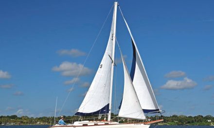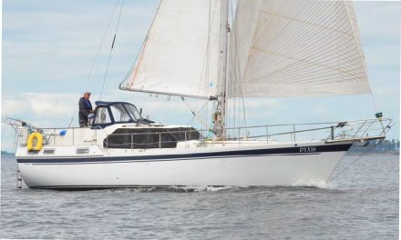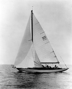
The Concordia: a timeless classic
People may be impressed by a millionaire’s rocketship, but “ooohs” and “aaahs” are saved for the classic.
A British author once wrote, in effect, that you can go away for a week’s cruise, and everything goes wrong: your favorite jib blows out, the portlights leak water onto your berth, the head plugs up, the engine only fires on half its cylinders, the stuffing box springs a leak, and you run out of rum. Disastrous? Yes! But as you row ashore from your mooring, you look back at your boat and, if she is truly beautiful, all her sins are forgiven.
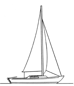
Folkboat: functional as a World War II Jeep
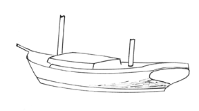
Beauty, of course, is in the eye of the beholder, and this is just as true for boats as for other art forms. However, with boats, particularly sailing yachts, art must be balanced with function. Function can be beautiful, too, and perhaps that is why the Folkboat (see illustration), as functional in her own way as a World War II Jeep, has always appealed to me as a truly great design and a very handsome craft indeed.
There are different forms of beauty: the purposeful, clean-lined racing machine; the traditional vessel reminiscent of the working craft of bygone years; the graceful classic with sweeping sheer and long overhangs; the modern cruiser with its short ends and purposeful lines. All can be beautiful in their own way if the design is balanced and true to type.
Fortunately for their owners and admirers, most boats were designed in the days before rocketship styling, bulbous curves, and radar arches became the fashion for boats, power and sail. It is interesting to watch the reaction of the general public when they see two large yachts, one a classic style and the other a rocketship, close together. People are impressed by the obvious big bucks poured into the millionaire’s custom rocketship, but they always save their “ooohs” and “aaahs” for the classic.
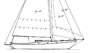
The Stone Horse by Edey & Duff. Sam Crocker knew how to do the raised foredeck
Classic ratios
The general “classic” hull-shape ratios for sailing yachts (see illustration), as taught to me by Bill Luders, were as below:
- Bow overhang to stern overhang 3:4
- Bow angle to stern angle 4:3
- LWL to LOA 2:3
- Bow to stern freeboard 8:6 or 9:6
With conventional concave (hollow) sheerlines, the freeboard was the same amidships as at the transom, and the low point of the freeboard was 80 to 85 percent of the waterline aft. Generally, racing yachts have a much flatter sheer than cruisers do, while workboat replicas have the greatest sheer, with the average cruiser somewhere in between (see illustration). The concave sheerline should be fairly flat forward, but never straight, with the curvature increasing gradually to the low point and then rising to the stern. It should never be the arc of a circle, as that is dull and unimaginative design.

This workboat type shows a plumb bow and double-ended stern
Few contemporary yachts, even the “traditionally” styled, will conform to the classic 2:3 LWL/LOA ratio. The newer designs, almost universally, have shorter overhangs in order to obtain the speed advantage and increased accommodations provided by added waterline length. The modern yacht is of lighter displacement also, and that poses its own problems. With a longer waterline and lighter displacement, there is less hull under water so the designer must use higher freeboard in order to obtain standing headroom.

A late 1970s cruiser shows a flatter sheer and popular reverse transom
The higher freeboard yacht can look good if given a somewhat flatter sheerline than the older classics but, even so, I would not relish designing a 35-footer for any of today’s NBA stars! High freeboard must be disguised by a judicioususe of cove stripe, paint line, rubrails, and wide boot tops, all running the length of the yacht in order to reduce the apparent height.

A straight sheer can look as if it’s a reverse sheer
Slight hollow
A straight sheer rarely works well on a sailing yacht, particularly one with long overhangs. The bow and stern are farthest from the eye, so optical illusion will make them appear to droop if the sheer is straight (see illustration). If a long line is to appear “straight” it must be given a slight hollow curvature. The Greeks knew this several thousand years ago when they built the Parthenon, but the principle is rediscovered from time to time.
For the same reason, the lines of rails, guards, cove stripes, and paint lines should not parallel the sheer or they will appear closer together at the ends than at midships. A toerail should be highest forward, reducing height gradually to the stern; cove stripes should be furthest below the sheer forward, rising gradually to a lesser distance below at the stern. If the lines are truly parallel, they will not appear to be so to the eye, and the result will not be as intended by the designer.
The reverse sheer, though rare, makes good sense for sailboats as it is very functional. The freeboard is high amidships where it provides maximum reserve stability, and the ends are low, reducing weight in the overhangs for maximum performance. Despite the advantages, the style never caught on to any extent so reverse sheer designs are few and far between, the Albin Vega (see illustration) being one of the better examples.
The raised foredeck is another style (see illustration) that never became popular although S. S. Crocker designed many truly lovely examples of the type. It is a style difficult to proportion properly (certainly I have never mastered it) and that may be why all but a few designers have avoided it over the years.
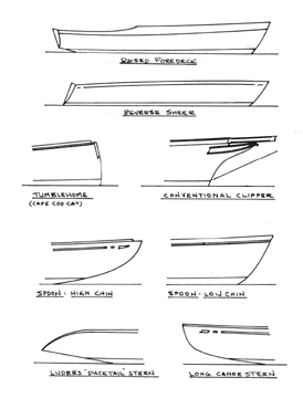
Sheerlines: raised foredeck and reverse sheer Bow profiles: tumblehome, conventional clipper, and spoon bows with high and low chins Stern profiles: Luders’ ducktail and canoe stern
True uglies
Usually, the raised quarterdeck sheer is seen on craft with “great cabins” aft (see illustration). A few have been quite handsome with well proportioned aft decks, but far too many are true uglies with an excessively high quarterdeck and boxy, tall deckhouses. As a rule, the stern overhang should be short and the style should not be used on vessels smaller than 40 to 42 feet (and longer is better) as it can look affected.
Bows take many shapes: plumb, raked, spoon, clipper, and even the tumblehome bow as seen on a few catboats. The long spoon bow can be beautiful but is now rarely seen except on a few older yachts. Those vessels, with their long bow and stern overhangs, were developed to suit handicap rules that favored short waterlines. As the rules changed, the waterlines became longer and the ends shortened. The resulting hull may not be quite as striking, but it does create a yacht that has higher potential speed and more interior room as well and, being functional, shorter ends are certainly good design.
A spoon bow should not be the arc of a circle as, once again, this is dull design. Just as with the sheer, the bow should have an ever-changing curve, perhaps shallow at the waterline with increasing curvature as it approaches the sheer. If the overhang is short, this style looks good with a bowsprit. The alternative, with maximum curvature at the waterline, decreasing toward the sheer, always works well.
The clipper bow has long been popular on traditionally styled cruising yachts but it is not an easy shape to design, and I’m the first to admit that some of my early attempts left much to be desired. L. Francis Herreshoff had an eye for a clipper stem and his comments in his book, The Common Sense of Yacht Design, are “must” reading for the budding designer. As LFH points out, too many clipper bows are rather atrocious, with excess reverse curve and ugly, exaggerated trailboards.
Refreshing change
Bald clipper bows (no trailboards) as used by Philip L. Rhodes on his lovely Thunderhead design can be very attractive also, and are a refreshing change from today’s all-too-common straight, raked stems. However, I’ll also stick my neck out and say that, despite the popularity of the Bayfield line, clipper bows with trailboards and no bowsprits always look odd and affected to my eyes.

A raised quarterdeck and bald clipper bow on a 42-footer
Stern shapes come in just as many varieties as stems and a few are shown (see illustration). I have not illustrated a contemporary super-wide reverse stern with an escalator leading up from the swim platform; functional it may be, but beautiful? Never!
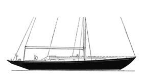
1962 Luders shows classic sheer and overhangs
Reverse transoms do have the advantage that they save weight in the overhangs and thus improve performance. I may even be responsible in part for the popularity of the style. Back in 1961 we were getting the 12-Meter Weatherly ready for the 1962 America’s Cup races. Bill Luders asked me to check how much weight we could save aft if we chopped off her lovely traditional stern to a reverse transom shape. I measured, calculated, and came up with a “cut off” line that would save several hundred pounds where it counts. That was enough for Bill. The next day the men were out there with a chainsaw! Weatherly successfully defended the Cup and, suddenly, reverse transoms were all the rage. Bill also designed the prettiest reverse transom of all, the “duck tail” style, on American Eagle, which we also used on many of his 5.5-Meter sloop designs (see illustration on Page 21). Pretty indeed, but much too slippery for moonlight walks!
Despite the preponderance of reverse transoms in contemporary yachts, the true cruiser can benefit by the added cockpit length and lazarette storage of the more conventional transom. This is particularly true if a quarter berth is fitted, as this eliminates one cockpit locker. To the cruising skipper, the added stowage provided by a big lazarette may be more advantageous than that extra 20th of a knot and, again, function can win out over style.
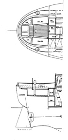
The cruiser stern: rounded on deck when viewed from above
Lack of buoyancy
The short, double-ended North Sea stern has long been considered suitable for bluewater cruisers, but it has its faults. The buttock lines are usually well rounded up aft, which can produce a slow boat and also one that may be prone to being pooped when running in heavy seas, as it lacks reserve buoyancy above the LWL. The ever-popular Tahiti ketch is an example of this type (see illustration). My answer, when a client wants a double-ender for bluewater voyaging, has been to develop a “cruiser stern” with more fullness on deck, almost round when viewed from above, to provide additional reserve buoyancy and ease the buttocks (see illustration). It is a functional shape, but not the prettiest to my eyes. However, one New Zealand owner of a 46-footer has put 170,000 miles under her keel in all weathers and swears it’s the best boat ever built, so the cruiser stern may have virtues other than function.

This double-ended schooner has a pinky stern and traditional clipper bow
Long sterns, whether counter or canoe type, always look pretty and have the virtue of good reserve buoyancy. In effect, the stern tends to rise nicely as a big sea sweeps under it, thus reducing the chance of being pooped. The long counter also picks up waterline length as the boat heels and so adds to potential speed – perhaps its main virtue besides appearance. The prettiest sterns of all may well be the heart-shaped transoms with raised taffrails designed by LFH for his attractive Bounty, Tioga, and Ticonderoga designs (see illustration). This type of stern fits perfectly with the lovely Herreshoff clipper bow. Big Ti, as she is called, is one of the most beautiful yachts afloat, in my opinion.
The heart-shaped transom of L. Francis Herreshof’s Bounty and other designs
The deckhouse can affect appearance almost as much as the hull. A lovely hull with an ugly trunk cabin will never be beautiful, but a well-designed deckhouse can turn a so-so hull into a very acceptable yacht. The cabin should harmonize with the hull, carrying out the flowing lines of the sheer. To achieve this, the line of the cabin should have a flatter curve than the sheerline, and the forward end of the structure should aim at the tip of the stem or the rail, if such is fitted.

The Friendship sloop has a clipper bow, raked transom, and a traditional sheer
Boxy and insipid
A cabin line that aims up into the blue, as it would if it exactly paralleled the sheer, can appear boxy. One that disappears abruptly into the foredeck may look insipid. Neither looks as good as the cabin that is designed to carry the lines of the yacht out to the stemhead (see illustration). Generally, the cabin-roof edge should parallel the waterline or increase slightly in height as it runs aft. It can appear quite awkward if the house is lower aft than forward. The cabin sides should have tumblehome (lean inboard), of course. One quarter-inch per foot of height is the minimum often used on older yachts with squared-off cabin ends. However, considerably more tumblehome is necessary if the forward end of the cabin is “streamlined” and heavily raked aft. A problem of such heavy tumblehome is the dollop of water you get whenever you open a portlight, but this is what you must pay to be in fashion.
While on the subject of portlights, round ports belong on ocean liners. A row of three, four, or more round ports on a small yacht is uninteresting and unimaginative design indeed, and such craft are much improved in appearance with elliptical or oval ports. In any case, a row of ports should not parallel the roof edge or the sheer. Rather, the row should be centered halfway between the deck and the roof edge where they will aim at the stem head, along with the other lines of the cabin and sheer, giving a harmonious appearance.
I suppose this is the time to mention the “streamlining” of deck structures. I’ve done it myself, with rakish cabins and matching window shapes, in order to make a yacht more “moderne” looking! Streamlining may make some sense on fast powerboats and on the rare large, ultra-light screamer that can exceed 20 knots in ideal sailing conditions, but it makes almost no sense at all to “streamline” the average 6- to 8-knot sailing yacht with heavily raked cabin structures. The saving in wind resistance is minimal, and the practice makes little sense. Indeed, a heavily raked cabin front has less interior volume and less deck space than a more vertical front and can even be dangerous at sea as the illustration shows (see illustration).
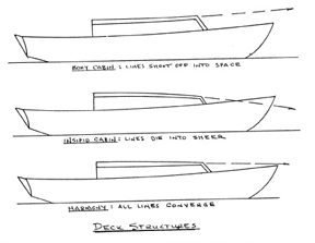
Deck structures: good and poor design
Gradual change
The rake of the deck structures, windows, stanchions, Dorade boxes, and similar, should change gradually. In many designs, particularly larger motor yotts (you cannot call them yachts), there is no relation between the angles of these various items, so the result is a hotchpotch that looks more like a cubist painting than a yacht. A recent professional magazine showed an illustration of two new Dutch motor yachts. The hulls below water were completely up-to-date but, above water, one was styled as a lovely 1930s classic and the other as an elegant 1950-ish craft. Both yachts will still be handsome 30 or 40 years from now. The same page showed a new super “streamlined” motor yott, all corners and angles, resembling a space station more than a boat. Some may have sympathy for the owners of such ugly vessels but, in my opinion, they deserve what they get. I have found that the owners of such craft are, all too often, the types who will roar close by at 25 knots, leaving you rolling and cursing in their wake.
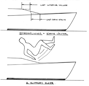
Streamlining may not offer good footing
Streamlining serves no real function on a craft that moves slower than a galloping plow horse, so it certainly cannot add to the beauty of the vessel. Excessive streamlining, stripes, fluting, and similar non-functional trim have no place on a proper yacht, be it sail or power. In future years, such craft will look every bit as dated as an antique Buick with its ridiculous fins, portholes, and tasteless chrome plate.
Yachts may be traditional, classic, beautiful, handsome, functional, or all of these combined, but they should never be ridiculous.
Article from Good Old Boat magazine, November/December 2000.


